CSS responsive design with clamp min and max
October 03, 2020min()
The min() lets you set the smallest value from a list of values.
For example:
.box {
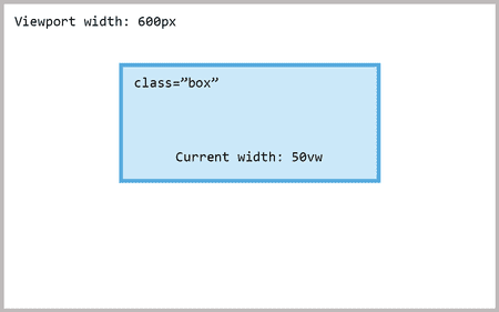
  width: min(50vw, 500px);
}
With this our box will have a width of 50vw or 500px. Whichever is the smallest.
If 50vw (50% of the viewport width) computes to a lower value than 500px the element will be 50vw wide.
In the example above the viewport is 600 pixels wide. min(50vw, 500px) will therefore return 50vw because 50% of 600 pixels is 300 pixels. And 300 is less than 500.
max()
Works much the same as its brother min() but it picks the largest value from a list of values.
.box {
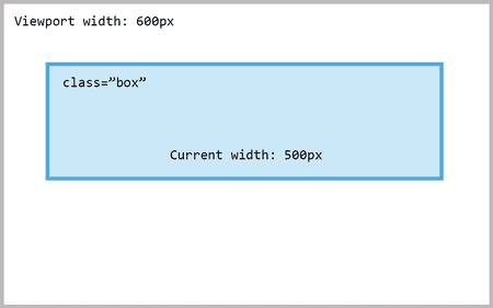
  width: max(50vw, 500px);
}
In this example our box gets a width of 500 pixels. Because 500 is greater than 300 (50% of the viewport).
clamp()
Clamp is effectively a combination of the min() and max() functions. It accepts three parameters:
- minimum value
- preferred value
- maximum value
Consider this:
.box {
  width: clamp(400px, 50vw, 1200px);
}
This will ensure three things:
- The width will never go below
400px. - The width will be
50vwas long as it’s not smaller than400pxor larger than1200px. - The width will never go above
1200px.
In other words, this makes it so that the box’s width is 50vw but never smaller than 400px or larger than 1200px.

